Varian Medical Systems Have Changed Their Logo!
(Without Telling Anybody!)
From time to time, large companies "update" their corporate logo, probably because they want to demonstrate their creativity and modernity.
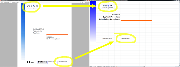
It took nearly a year until we realized that Varian Medical Systems (VMS) have changed their logo. They did not notify their customers of the change. We found out by coincidence, after downloading the new RapidArc commissionning test procedures for the TrueBeam from myVarian.com, and comparing the contained documents from November 2014 (left) and February 2015 (right):
It is evident that the logo change must have happened between these two dates.
Symbols on the New VMS Logo
Let's have a closer look at the old (left) and new (right) logo:
The change is rather subtle, but if we look at the fine details, we immediately realize that the new logo much better reflects Varian's business area and the demands of the global market. The latin characters in the upper row have been replaced by six universal pictograms, which is advantageous in non-latin countries like China or the arabic region. The pictograms obviously symbolize the potential hazards of medical devices (first and last item), the hopes which are generally associated with radiation therapy (items two and five), the effects of radiation on the human body (item three), and finally a blue hand (item four) which probably stands for Varian's general commitment to work for the benefit of mankind1.
Do we like the new logo? Yes! We like it a lot!
Notes
1Compare this to the Pioneer plague, where the man's right hand is "raised as a sign of good will".

